A restaurant's AI-redesigned menu made its own food look worse than the real plate
An Austin Filipino-Hawaiian spot swapped its menu photos for AI-generated images. The blogger who wrote it up ordered the actual $10 spamsilog and put it side by side with the AI version — the real food won by a wide margin.
A blog post collects small businesses that replaced real photography or plain typography with AI-generated menu and signage imagery — and argues the AI versions look worse, not just cheaper.
The centerpiece: an Austin restaurant's AI rendering of its spamsilog dish next to the actual $10 plate the author ordered. The real food is more appetizing than the AI's guess at it.
A commenter with 0.79 karma-weight standing: AI menus and signage are becoming "the dog whistle for 'cheap'" — telling customers what quality to expect before they've read a single item.
Real food versus the AI's idea of food
The blog post that generated 165 comments on Hacker News is built around a simple comparison: small businesses — restaurants, cafes, local shops — that swapped hand-photographed menus or plain typographic signage for AI-generated imagery, and how that imagery holds up against the real thing. Its centerpiece example is a Filipino-Hawaiian restaurant in Austin that redesigned its menu with AI-generated food photos. The author, who writes from a Filipino-American perspective on comfort food and cultural representation, ordered the actual $10 spamsilog dish and photographed it next to the AI's rendering. The gap wasn't subtle — the author describes the AI version as "uncanny" and actively unappetizing next to the real plate, undercutting the entire point of a menu photo, which is to make a customer want to order the thing.
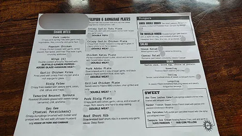
The author's broader argument is that this isn't really about cost — they work with small businesses in Austin and are sympathetic to tight budgets — it's about a choice that actively makes the product look worse than doing nothing at all. Plain typography with no images, in the author's read, would serve the restaurant better than a photo that quietly signals "we didn't actually make this" before a single dish has been ordered.
"The new dog whistle for cheap"
The thread's sharpest formulation came from a commenter with a 0.79 karma-weight standing: "AI menus and signage are quickly becoming the dog whistle for 'cheap'. It's telling you what kind of quality and service you should expect in the rest of their product or service." The comparison drawn was to earlier eras of low-effort signaling — a hand-scrawled chalk sandwich board, a menu clearly laid out in Microsoft Word — except AI imagery is a newer, less immediately obvious version of the same tell, one that takes a beat longer for customers to consciously register even as it works on them anyway.
A counterpoint pushed back on the framing: chalk signage has historically signaled the opposite — freshness, a menu that changes daily, a kitchen confident enough not to need a laminated photo menu. Whether AI imagery reads as "cheap" or "trying too hard" may depend more on context and execution than the technology itself. Another reply reframed the stakes generationally: as AI-generated imagery becomes harder to distinguish from real photography, "escaping AI slop will become a privilege for the wealthy" — higher-end restaurants keep real photographers and real food styling, while budget-constrained businesses default to whatever their AI tooling generates for free, widening a visible quality gap between price tiers that customers will start reading as signal.
The tell that won't stay a tell for long
The thread's more sobering point came from a reply arguing most customers today genuinely can't tell AI-generated food photography from real photography — and wouldn't especially care if they could. If that's true, the entire premise of the blog post — that AI menus are a visible, legible signal of low effort — has a shrinking shelf life. Right now, in mid-2026, the uncanny-valley tell is still visible enough that a blogger can build a whole post around spotting it. Whether it stays visible, or whether AI image quality simply catches up to the point where "real spamsilog versus AI spamsilog" stops being an easy game to win, is the open question the thread never quite resolved.
Get breakdowns like this every day
The top Hacker News stories, unpacked — by email, Telegram, or RSS.
He built an entire editable PowerPoint — slides, charts, live collaboration — into one HTML file
Bento is a single .html file that opens, edits, and syncs like a full presentation app: a readable JSON block holding the slide data, a compressed app shell underneath, and real-time multi-user editing routed through Cloudflare, all with no server-side app to host.